I saw this post on /r/math today, which asks if there is an intuitive illustration of the value of the constant e=2.7183… There are a few ways of showing this, including the definition of e as the upper limit of \(\int_{1}^{e}{\frac{1}{x} dx}=1\). This is definitely true, but isn’t particularly satisfying - you can see e on the graph, sure, but where does that value come from? There’s also the infinite series \(e=\sum_{n=1}^{\infty}{\frac{1}{n!}}\), but again it’s not too intuitive.
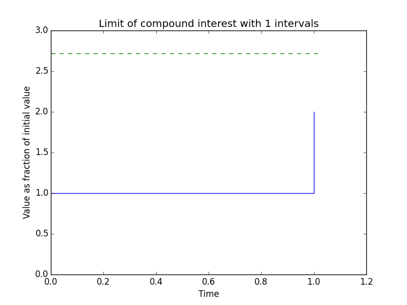
I remember watching this particularly catchy video on the constant e some time ago, and the compound interest graph 18 seconds into the video caught my eye - you can see how the value tends to e as the number of intervals increases. Not wanting to rip the visualisation straight from the video I decided to create a visualisation myself. That’s probably what you came here to see, so here it is:
the code
I used python and matplotlib to create this visualisation. I’ve never used matplotlib before, and I scarcely use Python either, so this is somewhat cobbled-together. Here it is:
import matplotlib.pyplot as mp
import matplotlib.animation as ma

def gen_data(steps):
    """Creates the data to be plotted in this animation frame."""
    x, y = [0.0], [1.0]

    for _ in range(steps):
        x.append(x[-1] + 1 / steps)
        if steps < 1000:
            # If the number of steps is less than 1000, then visually demonstrate the
            # presence of "steps".
            x.append(x[-1])
            y.append(y[-1])
        y.append(y[-1] * (1 + 1 / steps))

    return x, y

limit_x, limit_y = [0, 1.02], [2.7183, 2.7183]

fig, axis = mp.subplots()

def frame(i):
    """Creates the animation frame."""
    axis.cla()
    axis.plot(*gen_data(i))
    axis.plot(limit_x, limit_y, 'g--') # Show the actual value of e with a dotted green line
    if i >= 1000: # If the number of intervals is 1000 or greater, assume infinity (if only)
        display_intervals = "\u221e" # Unicode infinity, thank you Python 3!
    else:
        display_intervals = str(i)
    axis.set_title("Limit of compound interest with %s intervals" % display_intervals)
    axis.set_xlabel("Time")
    axis.set_xlim([0, 1.2])
    axis.set_ylabel("Value as fraction of initial value")
    axis.set_ylim([0, 3])

animation = ma.FuncAnimation(
        fig,
        frame,
        # The repeated values in the following array slow the animation down for key points.
        # I don't know matplotlib well enough, so there may be a better way, but this works.
        [1, 1, 1, 2, 2, 3, 4, 6, 10, 15, 20, 30, 50, 100, 150, 250, 1000, 1000, 1000, 1000],
        interval=25,
        blit=True)
animation.save(
        'anim.gif',
        writer='imagemagick',
        fps=4)
There isn’t a great deal to describe - I’ve detailed the repetition of animation frames in the comments of the code. You’ll need matplotlib (of course) to plot the visualisation and you’ll also need to have ImageMagick to create the animated GIF. Alternatively, you could use FFmpeg and change the final statement to generate an MP4 instead.
The code is available on Gist, too.